
Eight Mistakes in Responsive Web Design
Eight ways you're doing Responsive Design wrong.
Dec 2012
7Responsive web design is evolving. Every day we're learning new ways to improve how we build responsive web sites. What might have been the right way to do something six months ago is now the wrong way. It's not fashion, it's a process of continual improvement.
These are my Eight Mistakes in Responsive Web Design, and don't worry, over the last six months I've made all of them.
1. Disabling the Magnification
I used to use
<meta name="viewport" content="width=device-width initial-scale=1, maximum-scale=1, user-scalable=no">
without thinking, assuming that I'd cracked this responsive business.
But disabling the zoom facility, and taking control out of your users hands is bad form indeed. Don't make your users think you hate them.
2. Using Device Widths for Breakpoints
If I look back at my first responsive sites, I set up stylesheets for different device widths and I called them things like 1024.css, 768.css, and 480.css. I was designing my breakpoints to match well-known device widths.
This was before the Kindle Fire, HTC phones, iPhone 5, and an array of mini-tablets came along, all with a head-spinning variety of screen sizes. It became clear that setting breakpoints at device widths wasn't the best way of doing it.
So now I'm creating breakponts where the design breaks, and I need a new layout. It takes a bit of testing (on as many devices as possible) but I think it's the way forward.
3. Having Humongous Filesize
Remember when we used to design web pages for 56k modems? Well I'm old enough to even if you're not. Broadband came along and spoilt me with its billy-whizz fast speeds. I thought nothing of using 100kb images and even 200kb backgrounds on my web pages, until the day when I loaded them up on a phone.
We need to get back to thinking about filesize - someone on phone with a slow 3G connection won't think twice about leaving the site if your content isn't in their hands pretty damn quick.
4. Hiding Content
Don't hide content just because you can't fit it into a smaller screen.
display: none;
is not your friend. Assume your mobile users will want to do everything (and sometimes more) than your desktop users.
5. Making Compromises on the Design
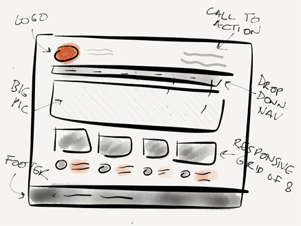
It can be tempting to create a web page design that will easily fold down to a neat mobile view, and put that ease of development above the visual design. Please don't let technology stifle creativity, or else all responsive sites will end up looking the same. Responsive web design is hard work, but the results are worth it, that's why it's so good.
Use something like the Responsive Grid System to make your design suit your content.
6. Forgetting about Touch
Remember that anything that's clickable and viewed on a smartphone needs to be the size of a thumb. It's why we have thumbs, isn't it? Apple themselves recommend the minimum acceptable size for mobile controls to be 44 pixels. And don't put links too close together, or big-thumbed users will never forgive you.
7. Thinking Small
Responsive design goes both ways, don't put all of your effort into thinking about what happens on small-screened devices and ignore what happens on when screens go supersize. The 27 inch Apple iMac has a whopping 2650 x 1440 px resolution.
8. Forgetting to Create a Home Screen Icon
That little PNG only takes a few minutes to set up, and using
<link rel="apple-touch-icon" href="/apple-touch-icon.png" />
means someone adding your web site to their iPhone home screen gets a pretty icon. Aah.
